For this page-based review the posters, and a screenshot shot for the film take up half of this double page film review spread. The title incorporates the name of the film "Mockingjay" along with its own added extra "The world of..." to show that they will be reviewing and analysing it. The text below tells the audience that the review will be looking at the films "Ideology, dystopia, and propaganda". This is so the audience who are interested in these things are attracted to the article and people who aren't know to move on to a different article. The review starts off with a little paragraph in a larger font, and then goes on to look at the film in relation to these specific aspects. The use of the water marks behind the text of the film's logo are effective as they provide depth to the look of the pages. There are three columns of text per page, making it easier for the reader to absorb the information. Due to the ratio of pictures to text, and the added stylised distraction of the water mark, you could say that this review has less substance than one that mostly focused on analysing and a lot more text. The title's font is the font that the film uses to advertise and is as linked to the franchise as their logo. This is important as it is eye catching to fans who will recognise it and subsequently want to read the review.

Even though a double page spread has been devoted to this review, only a mere 1/3 of it is taken up by the actual review. The rest is screenshots from the film. This is helping in attracting readers to the article as the pictures are eye catching and the small amount of text makes it easily digestible. Because of the large amount of space taken up by the pictures the reviewer has decided to place the title of the film and the subheading onto one of the pictures to save some space for the text. The first paragraph is in a larger and more readable font than the rest of the review. This is again to attract readers, in that it is easier to read and hopefully get them interested in what the rest of the review has to say about the film. This review is spaced out to have three columns, in typical magazine/ newspaper style. The title is in the same font as the film uses for its title. This makes the review recognisable to people who are interested or who have seen it before, and will attract them to the article.

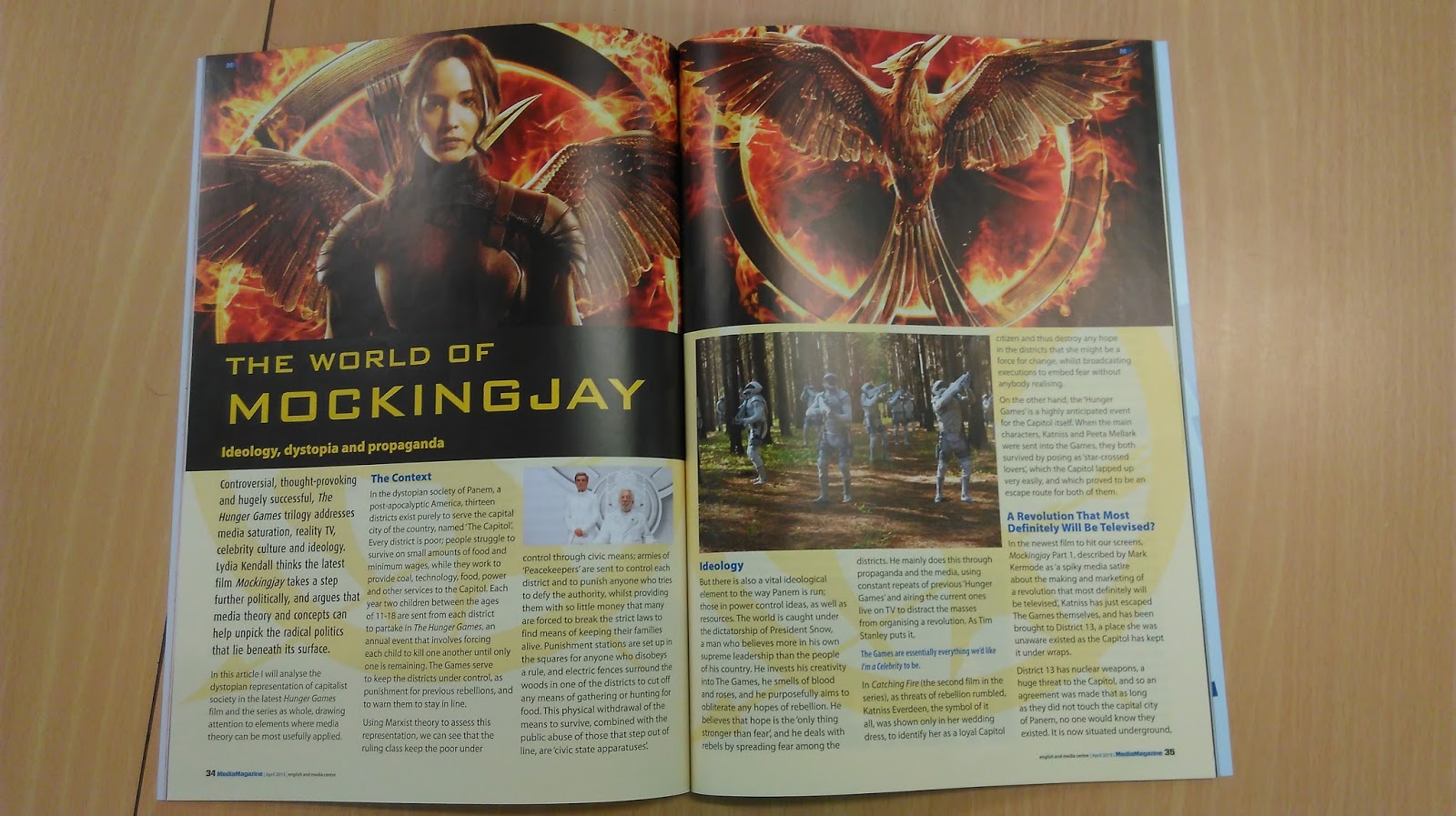
This magazine review has much fewer pictures than the others that I have looked at, the vast majority of the double page spread is taken up by text, which is reviewing and analysing the media in depth. It however still fits in three screenshots. The text is split up into separate paragraphs using red headings. This separates the text nicely as it is a very different colour to the main black text. Intrigue is created by using the word "perfect" in this sub heading, as readers want to find out why the reviewer thinks it is perfect, and it would make people want to find out for themselves if they think it is perfect. This is also a open ended rhetorical question. The use of this literary technique encourages the reader to keep on reading to see if the question is answered later on in the text. The paragraph at the beginning in the larger font helps ease the reader from the sub heading into the much longer smaller main text. The boxes on the side distinguish these separate bits of text making them easier for the reader to quickly read for a synopsis. The use of three columns also helps the reader read the text quicker, and more easily.

This film reviewer goes for a more simplistic aesthetic, by not including any pictures like posters or screenshots from the film. It does, however, let the reader know right away it opinion of the film, as in the title of the review it states the title of the film followed by the opinion "misses the mark". Below that it says "Rating: D" telling the reader in a easy digestible letter the overall review of the film. Usually reviewers choose to adopt the stars out of 5 rating, but this website has chosen to differentiate themselves in this quirky way.

The rest of the text elaborates on the opinions stated in the title and opening of the piece. The minimalistic styling creates an emphasis on the text and the analysis, breakdown, and opinions on the film. This website is targeting an older audience, people with experience in films, who want a serious in depth look at the high and low points of the film.

The review starts off with the title of the film and a tag line "- dark days in Metropolis " from the reviewer to tell the reader immediately their opinion of the piece. This is followed by a one sentence line to expand on this initial opinion. "Caped foes …" The picture below shows the two main characters facing each other as if in battle. This is not a poster but a screenshot from the film. A star rating is also used to efficiently tell the reader the reviewer's overall opinion of the film.

The review mentions the director straight away and references a previous film from the same cinematic universe. This tells the reader that the reviewer knows what they are talking about and that they are knowledgeable in the subject. They are giving their opinion with reference to the film, and other things the cast, crew, and cinematic universe have done before. This review is also distracted by adverts on the same webpage. This is because this is how the website makes money, by selling spaces on their website for people to advertise. This is something I will not be including in my review, but I am glad that my research has brought it up so I could decide that I was not going to include them.
No comments:
Post a Comment